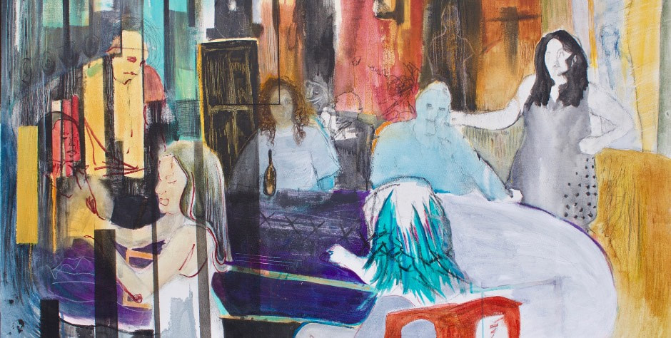
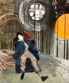
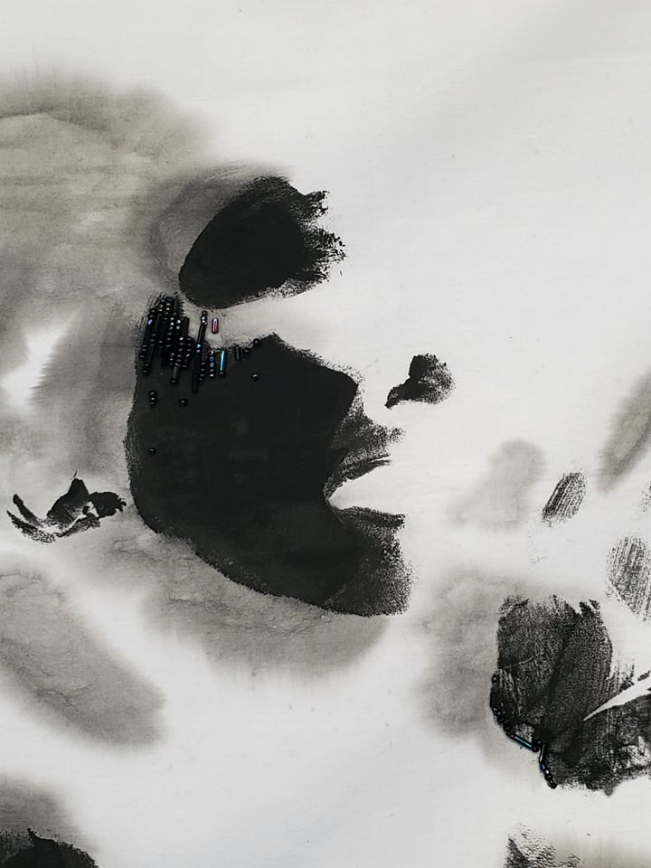
 Looking back to the last time I was able to review a show, I can tell the women in me are tired. This is also the title of a two-artist show at 1078 Gallery. The pair intersected in a Southern Oregon-based collective (Animus Collective founded by KYRIANNA). Isabella K. Saavedra describes her work as, “…a record of reactions to my own lived experiences, historical and generational trauma, and collective trauma taking place in our country the last few years.” KYRIANNA’s work aims at a 3-layer impact, "to provide a therapeutic experience for the people in the paintings, for viewers with chronic conditions to feel seen and represented, and to increase social consciousness and compassion around these conditions and what it’s like to live with them.”
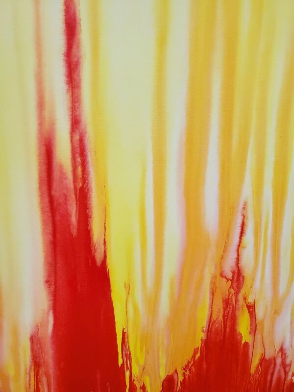
There is so much unearthed between them. The pain and sensations of various disorders as KYRIANNA paints represented as fluttering butterflies, stabbing cactus needles, mawing termites. I wonder what these sensations would feel like in my own body. Saavedra’s work literally deals with the excavation of native bodies in Canada, and the terrifying result of being a women and person of color during recent political times, with scrawled language and haunting figures. Together, their work makes a beautiful partnership. Saavedra’s tactile surfaces contrast stirringly with the polished surrealism of KYRIANNA’s watercolor portraits. Visually it encompasses so many feelings, and as I stare in the eyes of KYRIANNA’s portraits, the hard edges of my fatigue begin to soften. I love them, and I want to continue the work in my field helping folks understand how we normalize bodies, as there are always vast groups of people left out. I love Saavedra and want to improve the world and ease her anxieties. The woman in me with a searing lump in my throat and hot water gathering in the corners of my eyes remembers that I love. The woman in me that is tired from keeping my blended family together under times of stress, the woman in me that is tired from trying to motivate and see and care for hundreds of people every year in a virtual classroom, the woman in me that aches from the polarization of so many people I care for, the woman in me that is tired from watching the gaps widen to a seemingly irreparable depth, the woman in me that is tired from feeling like I am doing nothing while people are dying and suffering, the woman in me that is so tired she doesn’t even look like me anymore, is not remedied but, now, not so sore and choked. Please go see it. And if you see me there, please say hello? I love you too. On view until February 13th, 2022. Gallery hours are Friday-Sunday 10am-2pm. 1710 Park Ave. Chico, CA 95928, FREE.
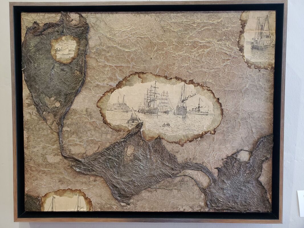
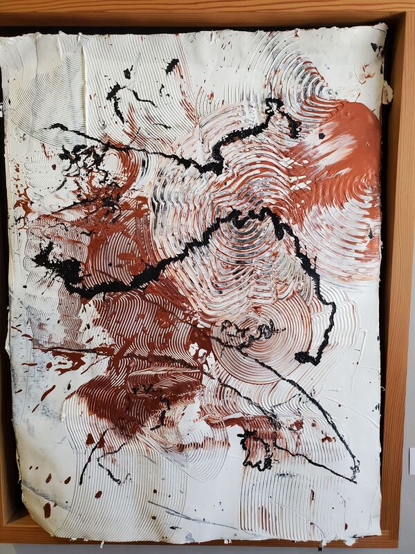
2 Comments
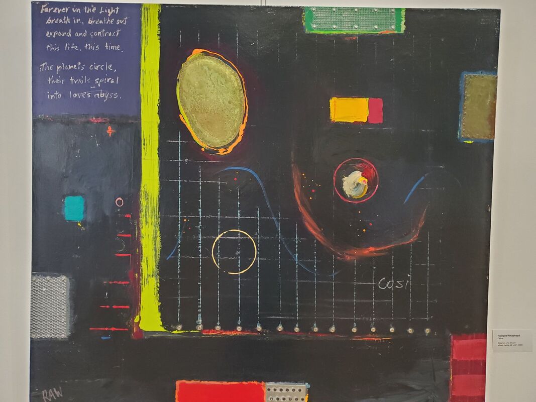
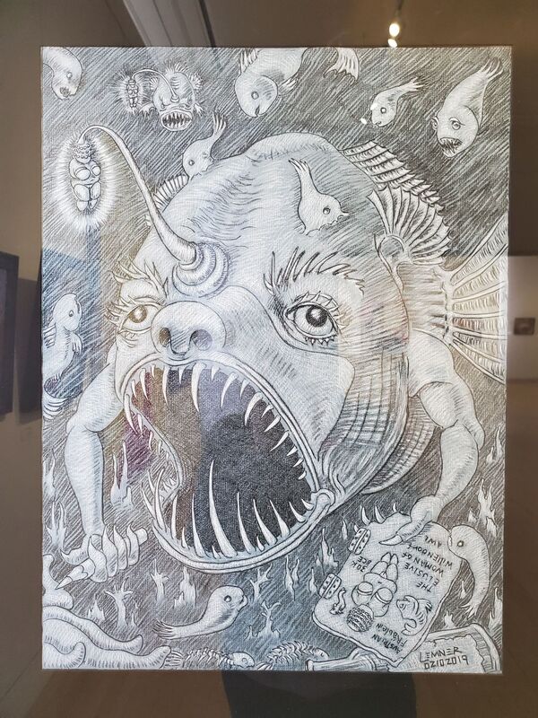
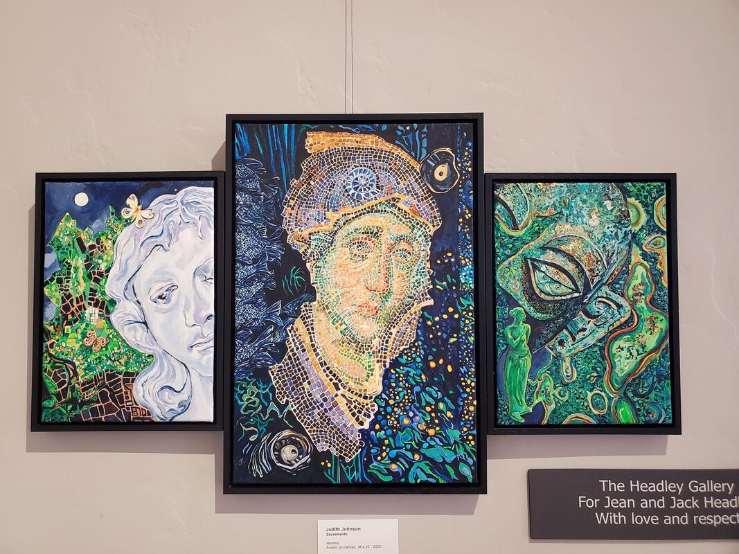
So much of the nature of my work has always been remote. I am unable to visit every single piece I research and write about. As a college instructor, I am not holding my classes in large museums, lecturing to students while standing next to the original work or strolling through ancient ruins. So much of my senses are left out in this process, which is why I was ecstatic to see “Dream State” in person last week. If you are nerdy enough, you can smell the materials. Don’t get too close to take a sniff, but the air wafts metallic around the bronzes and the hint of a musty, overcrowded artist’s studio emanates from a painting, all a beautiful part of the experience. I can imagine my fingers running over the incisions, raised and removed concentric circles, and slick surfaces of Zen Du’s Suspended Animation series. Every ripple and crinkle of Dana Mano-Flank’s Dawn at Sea has more presence, casts shadows, takes up real space. “Dream State” is hardly uniform in mood. There is the colorful surrealism harkening Salvador Dali with Ocular by Judith Johnson. Playful reflections and fantasy in a pastel palette are present in Zoey Rosenthal’s Where the Treasure Lies. Light-hearted, enigmatic and pretty like the best of what dreams can be. Not all is pleasant, however. Reaching for the Sky feels rather sanguine, echoing Argento horror films with the blood-red stain and drips. Marlis Jermutus’ large mustard and ketchup-colored composition translates as eerily beautiful and borders on nightmares. Arthur Lemner’s drawings, with angler fish and fierce, snarling beasts, add a necessary macabre element. Richard Whitehead’s Diagram of a Dream speaks in a language both familiar and unintelligible. A poem floats to the side of a diagram, and the impact delivers as much energy as a math teacher’s enthusiastic scribblings on a chalkboard. This is what I imagine my math genius brother dreams of. My dreams are more aligned with the many art historical references in the show. The aforementioned Dali, An Elusive Venus of Willendorf by Lemner, and Johnson’s Realms has a Byzantine Virgin Mary mosaic reborn in an acrylic triptych. A whole gallery is devoted to the work of Maria Alquilar (much of which was recently acquired by the museum collection). The New York-born artist moved after the death of her husband to Northern California, spending many years (off and on) in the Sacramento area. Her work is housed in collections such as the Crocker Art Museum and Smithsonian Institution. monca Executive Director, Pat Macias, was inspired to create an exhibition based on dreams upon “observing Alquilar’s mystical and very dream-like, detailed images.” The pieces are decoded somewhat in the label-text, opening a window into Alquilar’s stylized visual language. I recommend seeing in person, if you can, Dreamstealers, which towers over most visitors and enchants with mixed media, including twinkling LED lights.  “Dream State” and “New Acquisitions: The Work of Maria Alquilar” are on view through March 28th. Visit their website for more information.
Not able to attend, they have you covered. See their virtual tour! 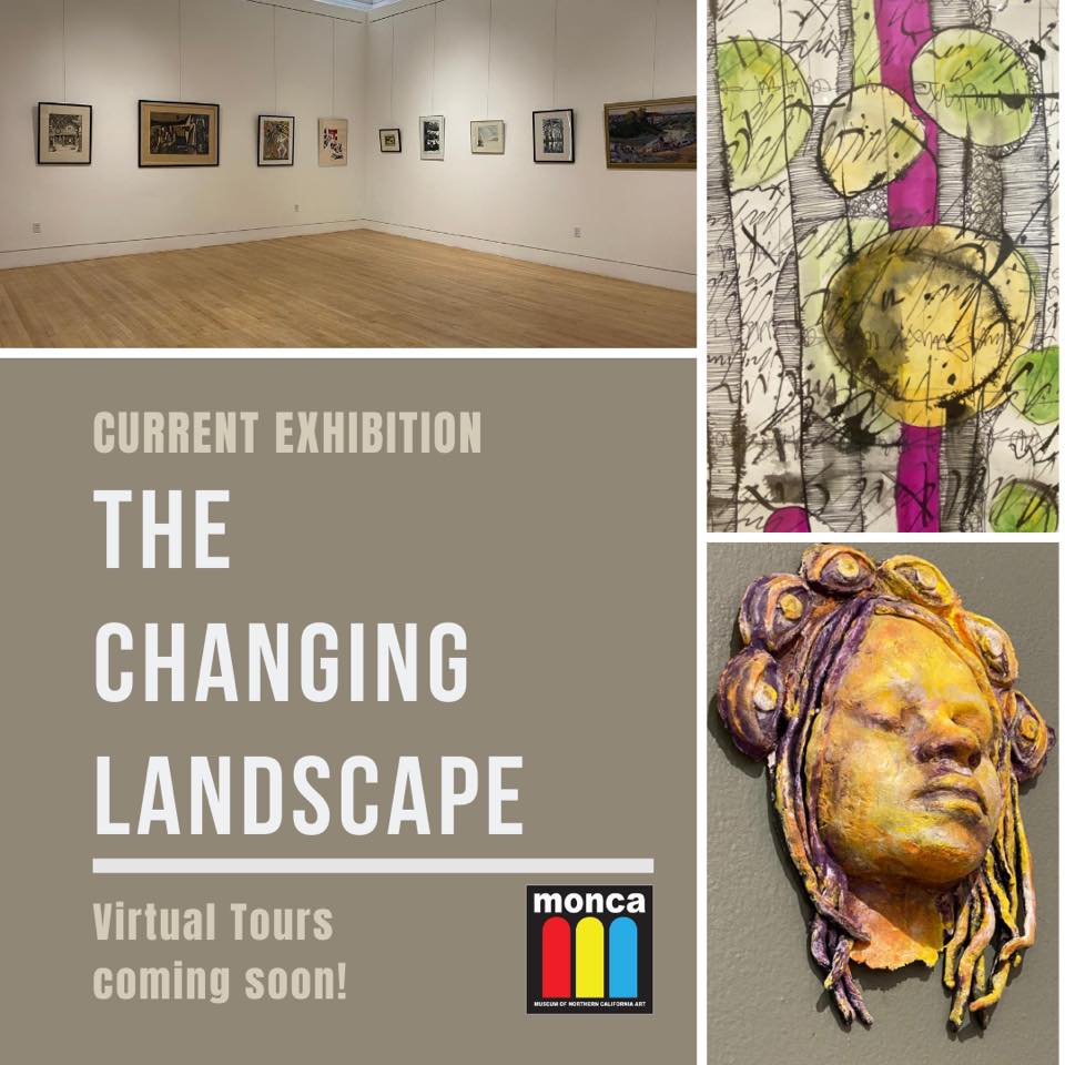 Back when we were installing this exhibition at the end of July, I felt as though I had reached several limits regarding isolation due to the pandemic, adaptability with my work (transitioning all my classes online), worry for my family/friends/students, but that was before the thunderstorm wrought fires up and down the west coast. Today, all those limits have continued to be pushed and feeling trapped in my home, I am fighting an internal darkness. I am momentarily pausing my distress to do something that brings me peace, thinking about art.
An initial, brief wave of melancholy breaks as I remember last being in the space with this work. I miss those devoted volunteers, the softened, filtered daylight that peeks behind the walls, the sanctimonious echo of my footsteps on the golden wood flooring, the big, open space of the galleries where I have made so many memories. Watching this video tour (posted below) stirred my veneration for the space (which serves as its own peaceful landscape) as well as giving me a second chance to meditate upon the artworks. There are many ways in which we use the term “landscape.” In art, as a genre of painting, landscapes can sometimes be overlooked by viewers. Perhaps they seem benign at first, but landscapes have always been imbued with ideas, communicating religious meaning in Northern Europe during the Reformation, or as a reaction to the Industrial Revolution in Romanticism, for example. We also talk about “political landscape” and using the word in this way can help materialize more abstruse concepts within a dialogue. This exhibition was intended to spark introspection and dialogue. Where I stand now, it appeals to my intuitive and emotional self-- sowing into those parts I find difficult to articulate. Timothy Moore’s Multiple Series activates several feelings with the frenetic line-work that wildly whips about. Some of the series looks like transparent pages of calligraphy, layered on top of one another with swaths of color interrupting the stark contrast of black and white. Others in this series have shapes composed of the buzzing, static electricity of his lines. Their calligraphic quality feels sacred, foreign, and set against the chaos of ink washes and blotches, there is a somberness juxtaposed with chipper pops of intense color. An installation by graffiti/mural artist Christian Garcia brings the outside in. Phrases like “No Justice No Peace” and “It’s Getting Hot Out Here” and a small image of the earth in flames, all resonate with our current events. The spray paint and seemingly random placement of varied sizes of text, makes it feel as though spontaneously created on the street over time by several anonymous people…a record of public thought. There is a push and pull, an attraction and repulsion characterized by a brightly colored rainbow and a white paper dove next to an overturned chair and discarded debris. This tension is carried throughout the exhibition. There is a lynched figure in Eric Richter’s Pervert, a miniature dystopia in Kandis Horton-Jorth’s matte-black assemblages, and Ama Posey’s large abstract painting now reads as swirling smoke and ash, yet the tone is not entirely bleak. The peeking hot pink in Posey’s Prologue or the Fauve-adjacent application of color in Ann Pierce’s abstract California Spring II, and the neon hues in the solemn, collaborative installation by Kristy Lively and Rakel Kieding Karbelnikoff, utilize the emotional power of color and evoke hope. There are pieces that reflect the state of the world in a more immediate way, whereas the elements of fantasy and science fiction in works like Scott Grist’s Strange Times allow my mind to wander and build connections. An undercurrent of something spiritual is one of the subtle outcomes from how these pieces speak to each other. I survey my interior landscape and discover a sense of calm. I don’t know what will happen, I don’t feel joyful, but I do feel grateful. I feel ready to solve problems and continue helping those in need. Watch the pop-up video tour here. monca is entirely volunteer-run and continues to work hard and safely to engage their community and beyond during these times. If you are able to donate or would like to support by purchasing a membership please visit their website. 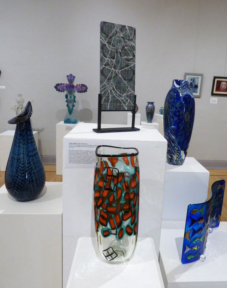 This is an unusual time, and an unusual review is called for! This exhibit was only open to the public for a few weeks, installed right before the SIP order and closed again as the county went on the watchlist. I was a part of the curating team and had a personal investment having grown up a glassblower’s daughter. I had a lot of eggs in that beautiful glass basket. I was concerned about safety and the state of the world, but in my heart, I also grieved when we could not open in March. I threw myself into what other museums were doing on their websites and social media. Working with very supportive people, we created virtual tours in rapid fashion to get the exhibition out in anyway we could. The exhibition committee was trying to pay homage to the local history and abundance of art glass, one of the things that makes Chico unique. For me, that history involved playing on the boulders out front of Orient & Flume (O&F). I would climb up the craggy side and slide down the smooth side. I remember a giant forest of bamboo and sitting restlessly at a bench where you could watch the glassblowers work in the torrid heat of the white-hot “glory holes.” It was a masculine scene with only a few female workers, mostly front of house and lappers. It was comfortable for me though. I liked watching the videotape on the history of O&F in their little museum corner of the showroom. My dad cut off the sleeves and collar of every t-shirt he owned. He always smelled of sweat but he didn’t really stink. His iconic white, cotton golfing hats had yellow-brown rims from constant perspiration. He rode his bike to work when I was young, and I was amazed at how early he would wake up. It seemed like he had “school” hours: up at 6am, back around 2:30pm. 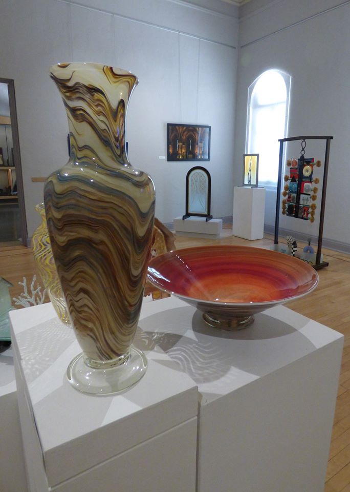 I was always so happy when he would make us breakfast on the weekends. Waffles were/are his specialty. He makes a mean burger too, calls them homeades. Before I had a sister to boss around, my dad would play barbies with me. He was always tired after work and would try to nap. He would lay on the couch holding a doll, doing his best to pretend according to my orders. “Dad…pretend like…” He would encourage me to pretend like they needed naps, I am now realizing out of his sheer fatigue. He is a great dad, and a talented artist. I never really cared growing up how he could be so good at something so hard. I loved to draw and was proficient for a kid my age. I wanted to be an artist and illustrate books. I loved books that had gorgeous illustrations. Later, I would try to major in Biology. I often defined myself in opposition to him. In reality, we are very much alike in some aspects. An important reason for why my dad is a great artist, is because my mom is also an artist. My mom graduated from CSU, Chico with a BA in Fine Art. She would have continued in school I am sure, but she had me. My dad didn’t have a formal art background, and mom’s ability to critique, to think deeply and conceptually definitely challenged dad’s art. I remember some yelling. I remember her sacrifice, devoting her time to being a mom and to managing a side operation that became a full-blown business once my dad left O&F. Our house is filled with art. My moms’ drawings, paintings, and photography cover the walls, even the outside of the house! My dad’s vases and bowls catch the light. His blown-glass Christmas ornaments get hung up with red ribbon and sprigs of mistletoe and holly when it is the season. Every family member of a certain age has a collection of his work from gifts over the years. It was our currency. It paid for my braces. We traded glass for yardwork and sometimes for more art! 2 adults and 4 kids lived on the sale of his glass and my mom’s tireless side hustle, coupon cutting, bargain shopping. We always had at least one vacation a year to make happy memories. 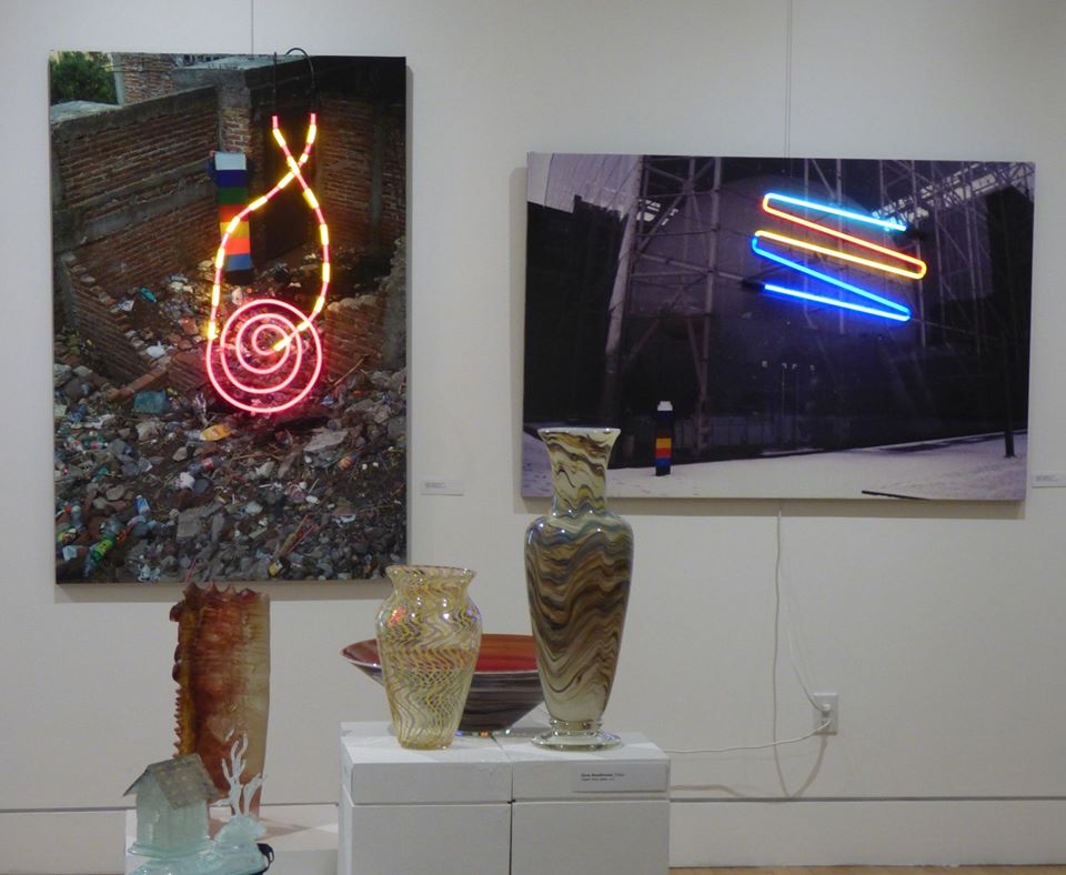 I remember being embarrassed when I gave an animal paperweight that my dad made to a friend for their birthday in my tween years. They looked at it and thanked me, but I felt that I was a loser for gifting them art. It wasn’t as cool as a game, or clothes, or some kind of makeup thing. I wish I would have felt pride rather than shame. I have grown up around art and despite my defiance, it has greatly shaped my life. I now teach the history of art, enjoy looking at and writing about it, and making spaces for it. No, I don’t dabble in glass myself. I tried in high school as dad was setting up his own studio, and I have some rough memories of startup struggles. 9/11 happened, I went off to UC Irvine, and without my help, dad succeeded. It is so strange to look back at how my view on art has changed. From taking it totally for granted to understanding its critical place in society, my love for family and for art now seem indistinguishably intertwined. I looked at this exhibition, and it connected vivid memories of my parents and our lives. You can enjoy it virtually in these links. Keep making art and keep loving your loved ones. Photo credits: Hannah Smallhouse www.youtube.com/watch?v=czZMuBHpE8g www.youtube.com/watch?v=j_fHTu1uXhU www.youtube.com/watch?v=F5q2Q240DKs 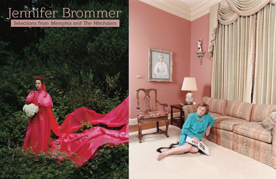 As Butte County slowly followed the lockdown patterns of more urban areas, I was able to sneak one last peak at art in person. I am so glad I was able to catch “Jennifer Brommer: Selections from Memphis and The Weschlers” at 1078 Gallery before they had to close.
Brommer is a photographer working in Portland, and Memphis and The Weschlers are two larger series of her work. Immediately, one is immersed into richly, patterned and highly saturated atmospheres. I was captivated by the documented excess in Memphis. Status is overtly stressed in the lavishness of the interiors. Exotic carpets, sumptuous drapery, floral duvets, zebra-skin rugs, create a spatial chaos and over-stimulation. Always sat against expanses of pastel or juxtaposed with, yes, more patterns, suggests the same ostentatious display of Rococo portraits. Poised just so, the figures seem frozen, overconfident, and yet, from another time…antiquated, in a beautiful sort of way. Brommer’s childhood was spent split between NY and Memphis, between her mother and grandmother, respectively. A disdain for social climbing, status, racial discrimination, is communicated through the unusual Lynchian world she has created within these photographs. The Weschlers is a more fantastical series. Brommer embodies her imagined Jewish immigrant ancestors from the 19th century. One cannot ignore the Cindy Sherman-like chameleonic transformations. Brommer’s performance is much more personal though, a deep dive into an imagined past. Captured in vivid colors set off by verdant surroundings, I forget that I am looking at the photographer in a staged image. Instead, The Weschlers are faintly anthropological in nature, illustrating quintessential archetypes. Not coming from an impersonal, theoretical place like Sherman’s 70’s film stills of generic female characters, Brommer’s images still function in a similar way. We imagine stories, characteristics, a past, present and future for each Weschler image. As we pause and go virtual for the moment, you can find many art resources online. If you missed it, you can see these stunning selections and more on Brommer’s website: https://www.jenniferbrommer.com/. Where I am delighted that art institutions are innovating to bring art to the home during these extraordinary circumstances, I hope we remember the value of seeing art in person. There will be a time when we can frequent galleries, centers, cafes, and museums once more, and I hope we will do so in droves. As many businesses suffer due to closure, so do our non-profit organizations, many of which run on the hard work of volunteers and on shoestring budgets. If you are in the place to do so, consider helping 1078 Gallery during these times: https://www.1078gallery.org/1078-rent-club.html. In a world filled with anxiousness it was nice to be immersed in another world, if only for a moment. 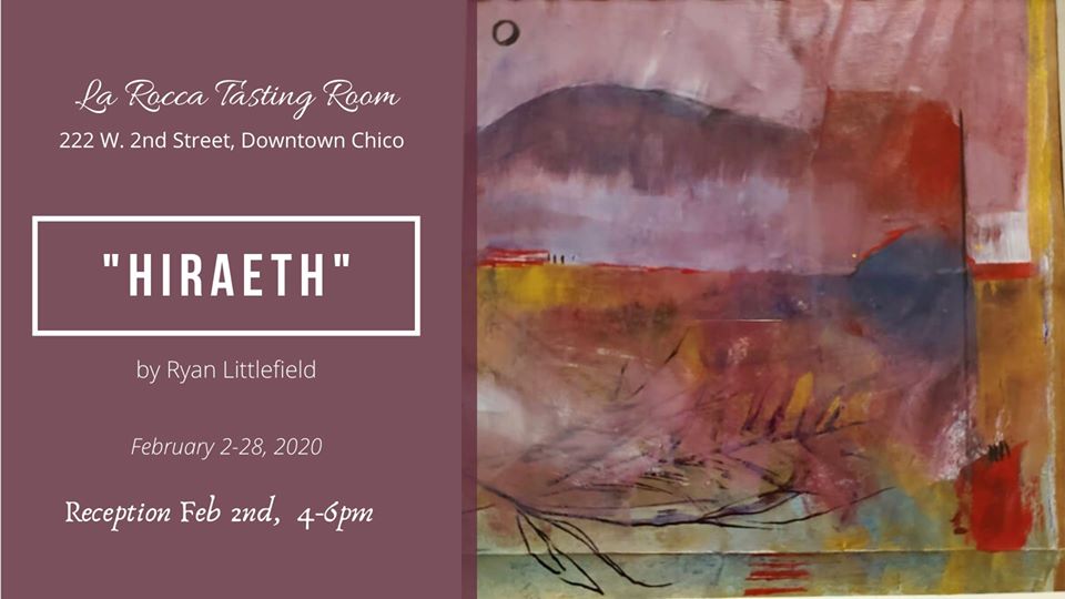 “Hiraeth” is a Welsh word analogous to homesickness, or a feeling of nostalgia for a place. An inescapable theme in Littlefield’s current exhibit is the loss of his childhood home in the Camp Fire. Revisiting the area, observing the skeletal remains of buildings and the metamorphosis of residual surfaces provides the foundation for such pieces as Confluence. The mottled texture of the white paint mimics the oxidized Maytag appliances enduring their new outdoor circumstances. With the occasional branch, mountain shape, blade of grass, the viewer can sense a landscape in the abstract application of color.
Yet there is added complexity with the prevalence of shimmering swaths of gold and vermillion. This color combination relates to celebration, associating with the Chinese colors of the New Year and money envelopes given to children as gifts. Bold red in the context of the fire could conjure the devastating power of nature, but Littlefield’s abstract use of colors in the landscape dissociates the images from that context. Yes, the charcoal gray and powder-blue washes create veils within the landscapes that could be interpreted as smoke, but also mist, or simply experimentation with color and texture. The series of small pieces requires close looking and dazzles with pairings of rich, bold colors, soft translucent layers, and strong warm/cool contrasts. The interesting textures are amplified by using paper grocery bags as supports. The creases add to the structural elements of Littlefield’s landscapes. Working in a smaller space, meant Littlefield had to work correspondingly smaller. The ephemeral and disposable nature of the paper bag contrasts the idea of the preciousness of art…the idea that somehow objects last forever. The word hiraeth came from Littlefield’s Welsh heritage. While the loose definition works poetically for describing his experience post-fire, the idea of translation is also an integral part of the work. Translation is always imperfect. There are so many elements to language (gesture, sentiment, idioms) that are lost, require verbose explanations, or simply don’t make sense in another language. When describing personal loss, perhaps this can be true too. Abstraction of forms in a visual language is a way of translating these feelings of loss and transience. I contemplate Littlefield’s experience as he enraptures the opening reception audience with stories, humor, historical knowledge and antiquated pop culture references. A natural performer. I take a moment to glance at the beaming faces of his friends and think- maybe he has found a new home. “Hiraeth” will be on view at the LaRocca Tasting Room (W. 2nd Street) through February.  A projection of the foothills on fire was the only sobering imagery in this otherwise sunny exhibit. The rest of the predominantly found-footage film by Chatkupt was sunlit, haunting, non-narrative, faintly documentary, and encapsulates the essence of citrusy Pasadena where both artists reside.
What I had perceived but not identified, until hearing the artists talk, was the presence of children. One can follow the youthful primary colors peppering the show. A lego block (Duplo…I stand corrected), a lemon held in tiny hands, a pacifier next to Nakaue’s ikebana/freakebana-inspired, digitally-animated film. I sense an incandescent childhood amongst these creative adults. Nakaue’s dancing, grass-covered, animated figure (so lovingly rendered), embodies the myth of Sasquatch matched with equal parts meme and gif. Her freakebana’s (the less formal, sometimes ugly, and very cool cousin of traditional Japanese floral arrangement, ikebana), contains the plants that remind Nakaue of her own Hawaiian childhood. Chatkupt built altar-like arrangements of photographs, criss-crossing powerlines, the cast shadow of a palm frond, rocks, leaves, and seed pods commemorated against white backgrounds, truly become treasures when removed from their hyper-urban landscape. 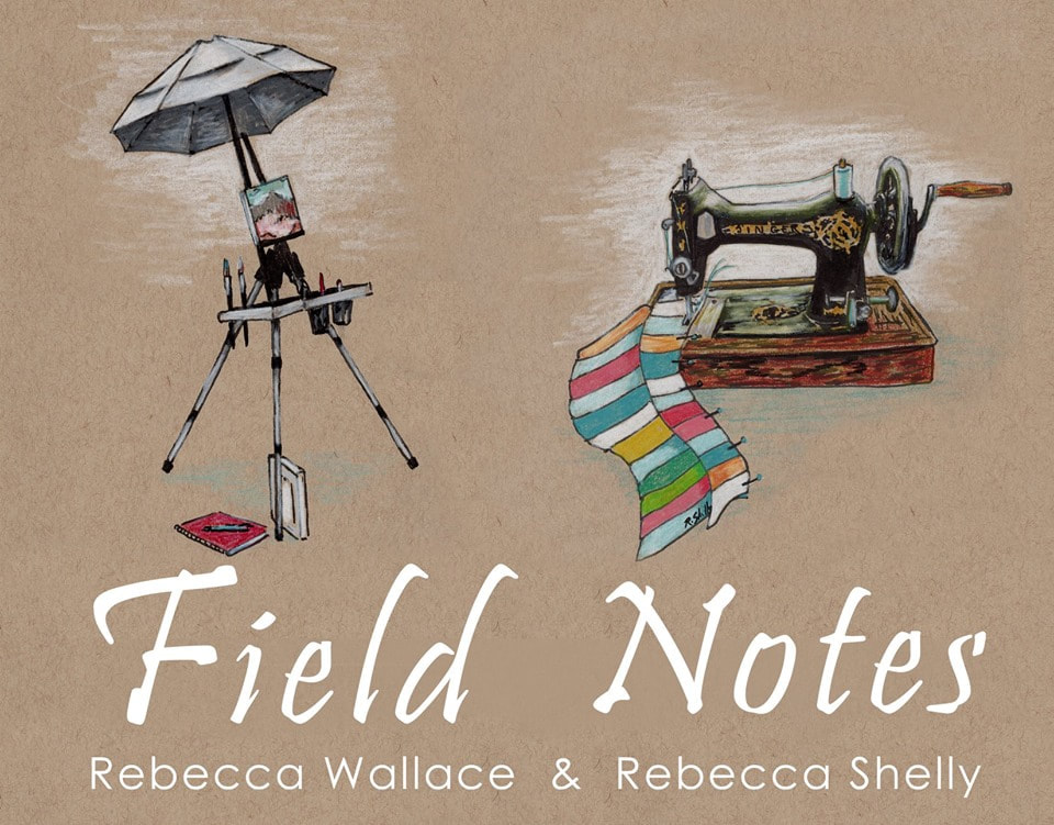 Field Notes features the plein air works of Rebecca Wallace and Rebecca Shelley at 1078 Gallery for September 2019. One is greeted immediately by a sage green title wall, with a display of quick sketches and paintings and a few curios; a refreshing break from the typical white gallery cube. The exhibition has the familiarity of a cabinet filled with heirlooms, accentuated by Shelly’s plein air quilts and rebuilt antique singer. Quilts have a warmth and proclivity for intimacy, but there is a range demonstrated in Shelley’s quilts that separates them from their utilitarian heritage. On top of the physical patchwork lies swirling stitches that bubble, creating a pebble-like texture against the brown fabric of “Poppies.” Many of her textiles constitute mixed media, utilizing paint and colored pencil.
Splendid defiance of expectations abounds in this collaboration. Where one would expect the soft, organic shapes often found in nature, the visitor is met with a surprising degree of structure. Wallace’s prints offset her more naturalistic oil paintings with patterns and geometry in faded Diebenkorn-like blues. Shelly’s quilted beach scenes also deny the sweeping curves of the ocean lapping the sands with rigid, geometric rhythm in varying shades of fabric. The studies, Singer, and woodblocks on display open a window into their journey; two artists, sometimes dappled in sunlight or dampened by fog and ocean breeze. Reminders of their process through an unfinished quilt and the equipment they used to create, reminds us of transition. A gallery exhibit often suggests something finished and in some ways stagnant, but the notion of remaining potential is fitting for plein air work. It is as though their process is unfinished, perpetually changing, much like the natural settings they spent days in will continue to change after the artists depart. Violet thread in Shelly’s flowers is echoed in Wallace’s painted cliffside, a seamless transition, their creativity extended from how they create their own personal work, into how they marry the media and expression. It is strange to feel at home in a space that still challenges and provokes, and Wallace and Shelly do just that. Perfectly.  Pakbaz creates a dreamy environment of acid-tinged pastels in her newest exhibition to date, Mariam Pakbaz: Something Not Yet Made. Washes of color layered with expertly illustrated figures and animals create an unsettled nostalgia. Brilliant mustards on warm wood grain, and majestic deer recall masculine 70s advertisements whereas languid ballet dancers in cool, distressed blues resting on green foliage echo Art Nouveau qualities.
Wistfulness is peaked by the carefully selected omissions. An obscured face, a stroboscopic pencil outline of a figure, and the overall gauzy appearance visually depict the ache of memories. Haunting, sweet, harsh, and lovely. Looking at her work takes me to memories of reading hand-me-down children’s books with gold binding, how one decade blends into the next before truly becoming distinct, slowly dissolving faces of people I have not seen for a long time. Aptly titled, Something Not Yet Made feels like an invitation to see where her mind travels next. |
AuthorSara Smallhouse is tenure-track faculty in Art History at Butte College, teaches every once in a while at CSU, Chico, and is on the Board of Directors of monca (Museum of Northern California Art). She likes to walk around and look at things with her family, friends, or solo. Archives
February 2022
Categories |
 RSS Feed
